case study / capital markets mongolia
designing mongolia's first ai-native capital markets platform
Capital Markets Mongolia needed an intelligence platform that could serve finance professionals and general investors alike. 910studio designed MarketIQ — from initial exploration through client workshop to a production-ready Dense direction that became the foundation of the entire product.
Capital Markets Mongolia
910studio
9 Weeks
Design System, Token Architecture, Frontend
No Bloomberg for Mongolia. No AlphaSense. Nothing.
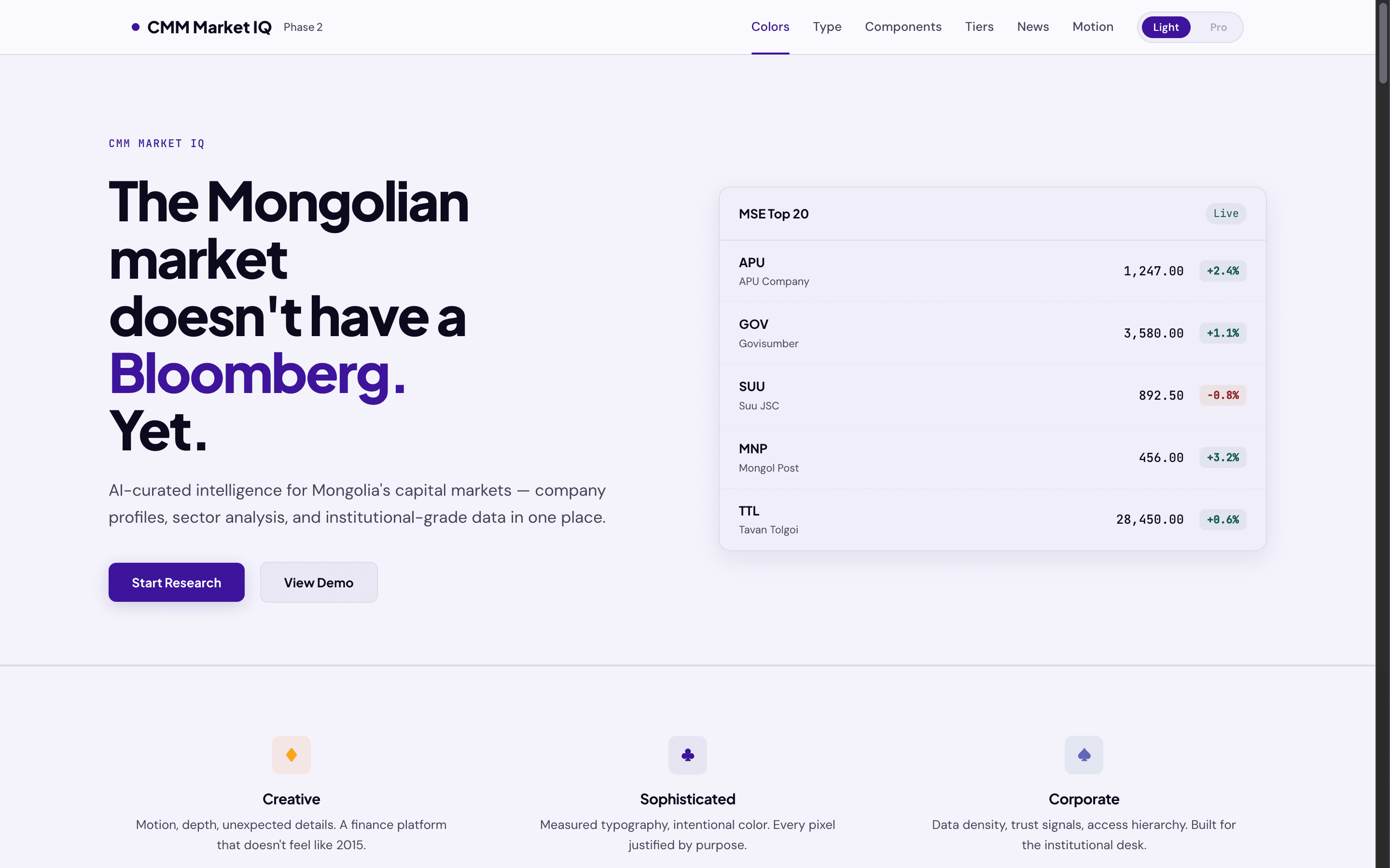
Mongolia's capital markets are growing fast — mining IPOs, foreign investment, cross-border deals — but the entire ecosystem runs on PDFs, email chains, and Yahoo Finance tabs. There is no centralized intelligence platform. No entity database. No research hub. CMM, the country's leading capital markets advisory, wanted to build one from scratch.
The problem isn't just "build a website." It's building credibility. The platform needs to earn trust from institutional investors who live in Bloomberg terminals AND general users who've never seen a P/E ratio. Same product, same brand, two completely different density expectations.
Building the visual vocabulary
Before touching a single component, we mapped the landscape. Moodboards, typography pairings, color systems, and early component explorations.
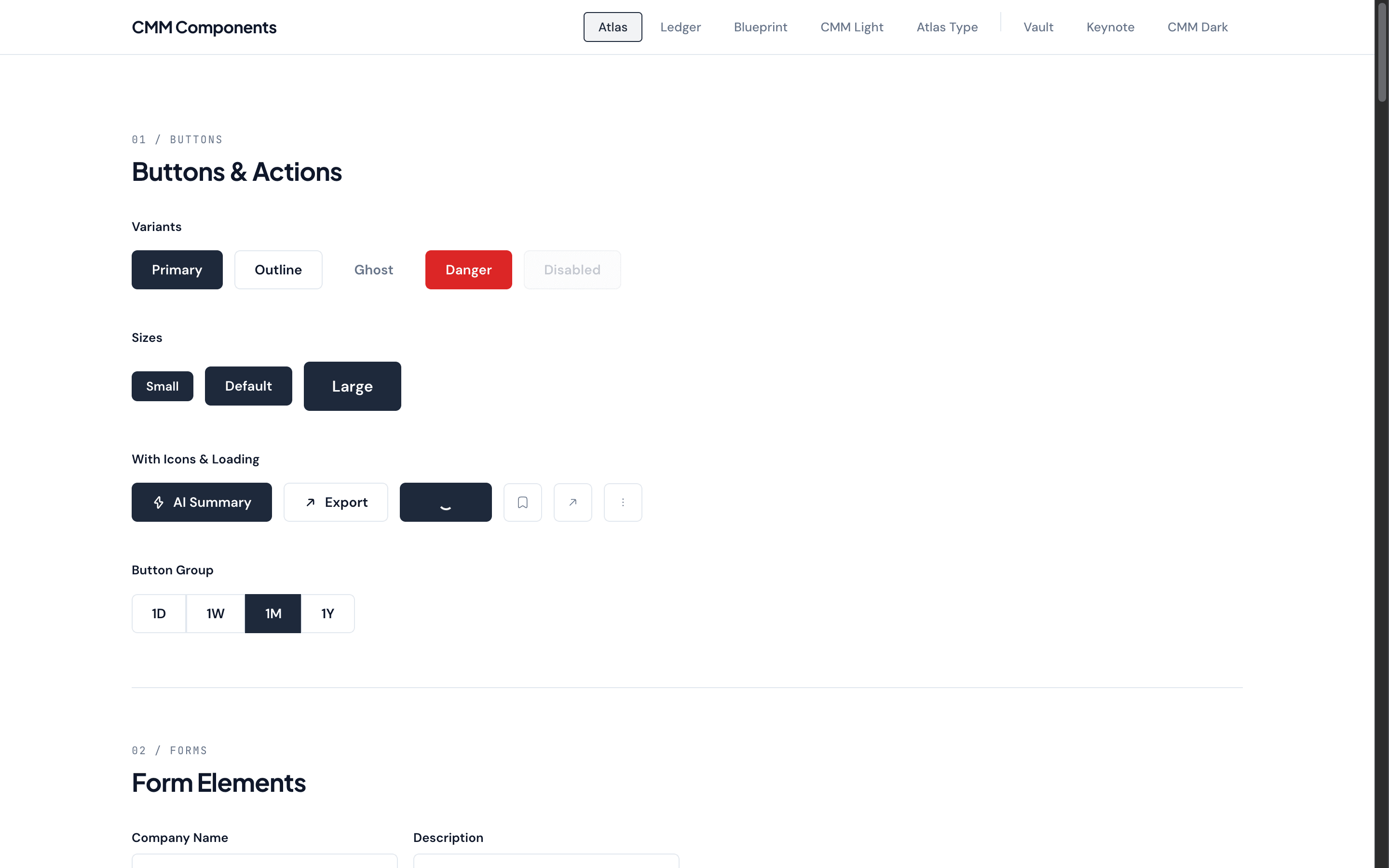
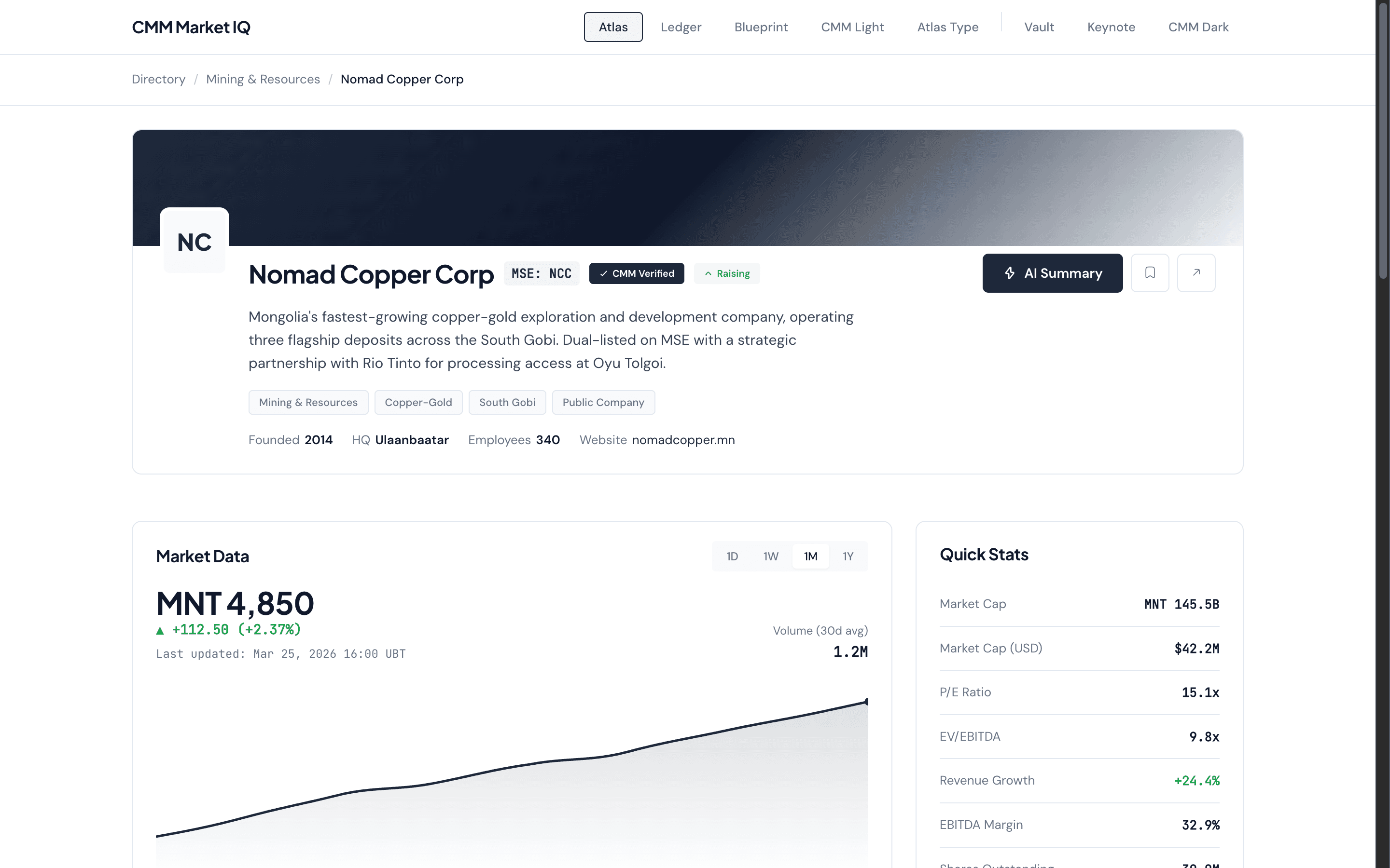
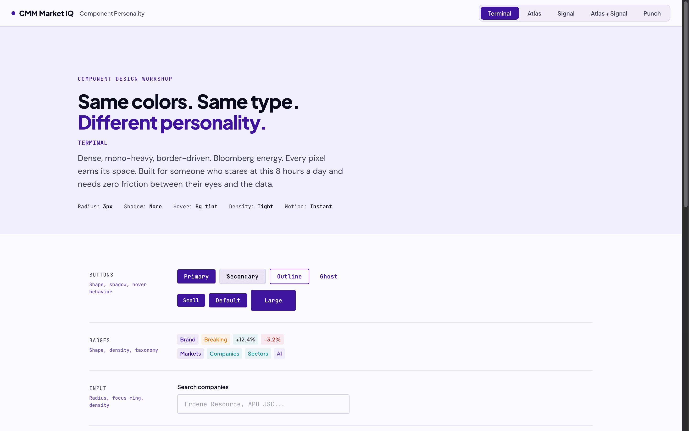
How finance platforms earn trust
We studied platforms across the density spectrum. The key insight: data density is a feature, not a problem, when visual hierarchy is right.
AlphaSense
Font readability, ease on eyes. The benchmark for "professional but not intimidating."
Bloomberg Terminal
Progressive disclosure philosophy. "Concealing complexity." The client loves it — opposite of what we expected.
Koyfin
Bloomberg density with modern UI. Composable dashboard modules. The target experience.
Crunchbase
Entity profile structure, company cards, data organization. Adapted for the Mongolian market.
Yahoo Finance
"The bible" for CMM's team. News aggregation, ticker bars, content categorization.
Pitchbook
Detailed financial data presentation. Deal flow tables. Reference for data-heavy views.
The client chose Dense
We ran a structured workshop with CMM's leadership. Three complete directions: Editorial, Dense, and Polished. The client chose Dense. Finance professionals gravitate toward information density.
"Creative, Sophisticated yet Corp"
Client mandate — CMM leadership workshop, March 2026
Four directions died so Dense could live
Design is as much about what you reject as what you ship.
Mono
"Too general." The monospace-first, terminal-inspired direction felt interchangeable with any SaaS startup. No brand identity. No personality.
Ledger
Conviction-over-decoration. Notion-energy minimal layouts. Technically clean, but the client explicitly rejected restraint. They want brand presence.
Blueprint
Engineering-forward with grid overlays and technical aesthetics. Too cold, too niche. Investment bankers won't trust a platform that looks like a CAD tool.
Pastel Soft Tones
The consumer fintech look — Revolut-adjacent, friendly, approachable. But CMM serves institutional desks. Soft colors signal "toy."
The directions that died weren't bad design — they were wrong context. Ledger would be fire for a dev tool. But for a Mongolian capital markets platform that needs to earn trust from bankers? Dense was the only answer.
910studio design rationale
Western structure meets Eastern density
The client specifically requested a blend of Western and Eastern UI design. Western finance platforms prioritize whitespace and hierarchy. Eastern platforms pack information and use color as a navigation system. Dense lives at the intersection.
AlphaSense-grade readability — measured whitespace even in dense layouts
Clean typography hierarchy — Plus Jakarta Sans for authority, DM Sans for comfort
Professional component design — buttons, badges, cards follow Western SaaS conventions
Measured spacing rhythm — 32px section gaps, 12px grid gaps, 14px card padding
Prominent color coding — red/green for financial data is non-negotiable in Asian markets
Category badges as primary navigation — color-coded tags guide scanning
Higher information density — 4-column grids, 38px table rows, compact stat blocks
Bold brand color throughout — every surface whispers purple
Bloomberg conviction, CMM identity
Dense packs maximum information per pixel without sacrificing readability. 4px radii. 12px grid gaps. Compact 34px buttons. Every surface carries the brand through purple-tinted shadows and lavender backgrounds.
color system
Brand Primary
#3E149C
Brand Light
#6B4CC0
Signal / Orange
#FCA311
Background
#FAFAFD
Foreground
#0C0A1D
Positive
#059669
Negative
#DC2626
The system behind the system
Every component references the same set of CSS custom properties. Change one token, every surface updates.
| Token | Value | Why |
|---|---|---|
| --card-r | 4px | Minimal rounding — every pixel counts in Dense |
| --card-p | 14px | Tight padding without crushing content |
| --grid-gap | 12px | Cards sit close — scanning is the interaction |
| --grid-cols | 4 | Maximum entities above the fold |
| --btn-h | 34px | Compact buttons — UI, not marketing |
| --t-row-h | 38px | Table rows pack tight, still clickable |
| --badge-tt | uppercase | Dense badges scan faster in caps |
| --badge-ls | 0.06em | Just enough tracking for caps readability |
| --w-head-bg | var(--bg-alt) | Lavender widget headers — brand in every surface |
| --shadow-* | rgba(62,20,156,x) | Brand-tinted purple shadows — even elevation carries identity |
Four page types, one Dense system
Every page in MarketIQ shares the Dense token system. These are live, interactive demos — scroll, hover, click.
One Dense system, three access tiers
The Dense direction scales across three user tiers. Same brand, same tokens — information access increases as users commit.
Public Tier
Attractive entry point. Key data visible, advanced metrics blurred.
Registered Tier
Full profiles, basic charts, financial summaries.
Premium Tier
Everything unlocked. AI insights, multi-metric rows, export tools.
Shipped.
From blank brief to production direction in three weeks. A structured client workshop validated the Dense direction. A complete token system powers every surface.
Page Prototypes
Fully interactive HTML demos with real Mongolian market data.
Design Tokens
Colors, typography, spacing, shadows, radii, easing — all brand-tinted, all production-ready.
Access Tiers
Public, Registered, and Paid — density scales with commitment, identity stays consistent.