case study / juraan bronze sculptor
we studied bronze to design pixels
An award-winning Mongolian sculptor with four decades of bronze work and zero online presence. 910studio took this from blank canvas to shipped product — researching the lost-wax casting process to extract the color palette, designing a custom typeface from scratch, engineering a 7-layer vignette system, and building a cinematic gallery experience that makes a screen feel like a dark room full of bronze. Solo execution. Design to deploy.
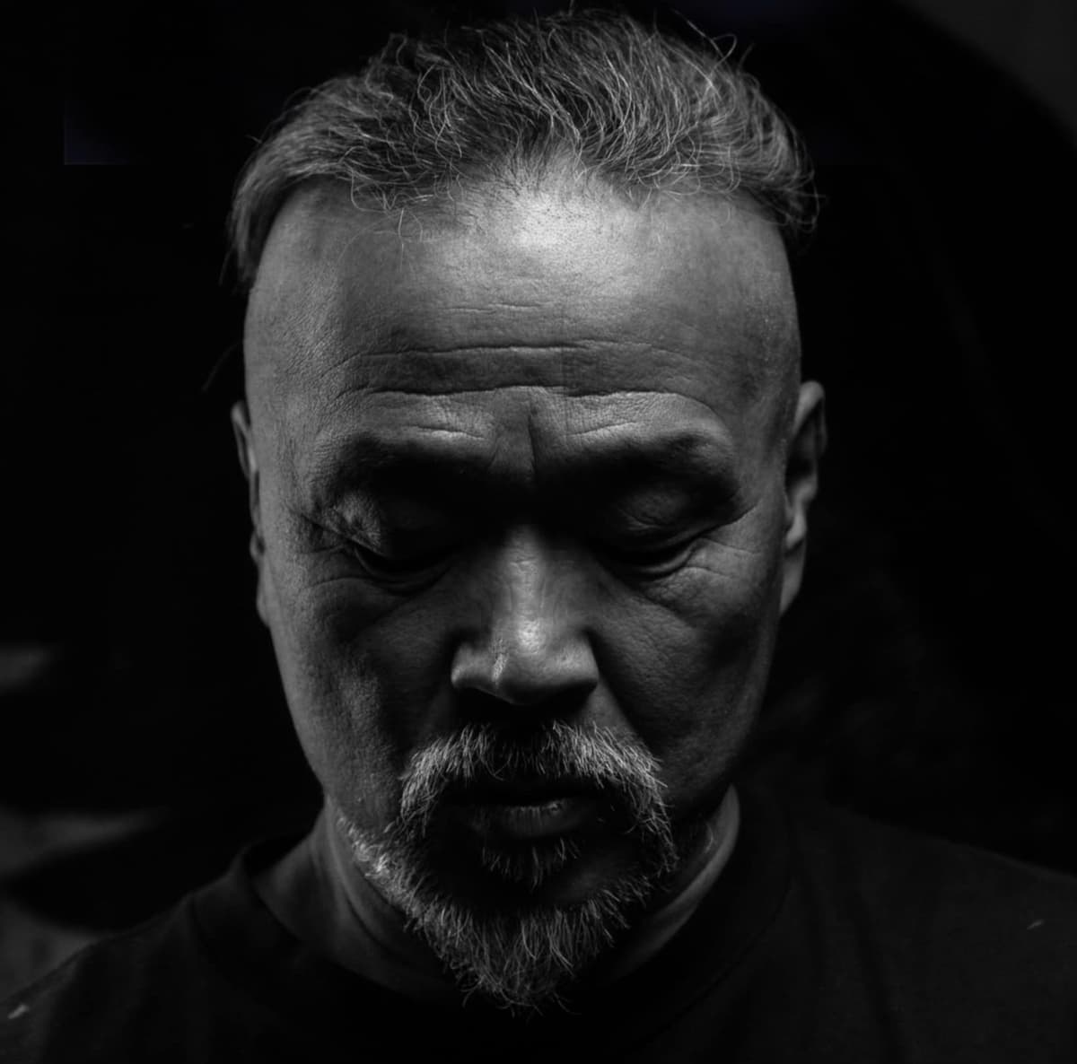
Juraan (Lkhagvasuren Nyamkhuu)
910studio (solo)
Research, Design, Custom Font, Frontend, Deploy
SvelteKit / Tailwind / Lenis / Vercel
juraan.com
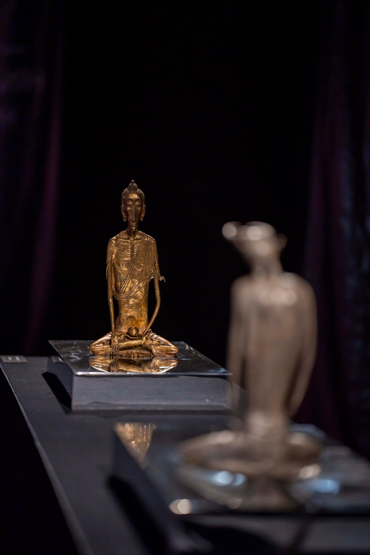
The client had 37 years of work. We had zero references.
No existing brand. No style guide. No mood board. No previous website. The client — a sculptor with Government Palace commissions, Noma Concours awards, solo exhibitions across four countries — had never been represented digitally. We were starting from the material itself.
The challenge for 910studio wasn't "build a portfolio." It was figuring out how to make a screen carry the weight of bronze. How do you translate the warmth of patina, the darkness of a foundry, the scale of a 115cm Pegasus into pixels? A template would insult the work. We needed to derive every design decision from the medium itself.
Sculptures to Catalog
Multi-angle photography
Existing Brand Assets
No logo, no colors, no type
Pages to Design
Each with unique layout
Person Executing
Design → Code → Deploy
We studied bronze casting before opening Figma
910studio's first move wasn't wireframes — it was research. We studied the lost-wax bronze casting process end to end. Not for content — to extract the design language from the material. Every color, texture, and mood decision on the site traces back to how bronze is physically made.
Wax Sculpting
The sculptor shapes the original in wax over a clay core. Every texture, every fingerprint is intentional — this is the only stage where the artist's hand directly touches the form.
Mold & Cast
A ceramic shell encases the wax. Molten bronze at 1,200°C replaces it. The wax burns away — 'lost wax' casting. Nothing is preserved except the form itself.
Patination
Chemical oxidation gives bronze its color. Heat + acid + time. The warm golden-brown (#D4AF7A) that became our primary accent — pulled directly from this stage.
"The color isn't chosen. It's discovered."
#D4AF7A — the exact warm gold of patinated bronze became the primary accent for the entire site.
We reverse-engineered the palette from physical bronze
With zero brand assets to work from, we derived the entire color system from the casting environment. Near-black (#0A0A0A) maps to the foundry darkness. Bronze Light (#D4AF7A) is fresh patina. Bronze Dark (#8C4A1B) is aged oxidation. Even text colors reference smoke and ash. This isn't a picked palette — it's a discovered one.
Bronze Light
#D4AF7A
Bronze
#CD7F32
Bronze Dark
#8C4A1B
Background
#0A0A0A
Elevated
#141414
Text Primary
#E5E5E5
Text Secondary
#A3A3A3
Border
#262626
We designed a typeface that exists nowhere else
No existing font carried the right weight. So we made one. The "Juraan" display typeface was designed from scratch for this project — not licensed, not sourced, not on Google Fonts. It's used exclusively for the hero and key headers. One weight, one purpose: presence.
type system
| Role | Font | Usage |
|---|---|---|
| Display | Juraan (Custom) | Hero titles, section headers. One weight, maximum presence. |
| Heading | Cinzel | Section titles, navigation. Classical authority. |
| Editorial | Playfair Display | Subtitles, pull quotes. Italic for editorial grace. |
| Body | Sabon | Long-form text. Optimized for reading on dark backgrounds. |
| Technical | JetBrains Mono | Labels, metadata, dimensions. Monospace precision. |
Fluid type scaling via CSS clamp() — hero ranges from 3rem to 6rem, H1 from 2.5rem to 4rem, body from 1rem to 1.125rem. Zero breakpoint overrides for font sizes.
We built a gallery, not a website
The core design decision: this should feel like walking into a gallery at night, not browsing a web page. We used near-black backgrounds as gallery walls, layered vignettes as dramatic lighting, and film grain for analog texture. Sculptures emerge from darkness — grayscale by default, color on hover. The metaphor drives every technical choice.
Video + 7-Layer Vignette
Background video overlaid with: base darkness, primary radial vignette, secondary tight vignette, refined inner shadow, corner gradients, edge burn, and animated film grain. Seven layers, one feeling: depth.
Bento Grid, 6 Size Variations
Six size patterns — hero pieces get 2x3 cells, smaller works get 1x1. The rhythm prevents monotony across 37+ sculptures. Stagger-reveal on scroll.
Cinematic Split — God & Devil
Full-screen three-panel — Devil left, narrative center, Buddha right. Radial vignette unifies both sculptures. Click-to-zoom modals. Completely different mobile layout.
Grayscale → Color on Hover
Desktop images load grayscale, reveal full color on hover. Sculptures emerge into light as you engage. Mobile shows full color immediately — touch doesn't hover.
We gave the signature piece its own layout system
The "God and Devil" duality is the client's signature work — it deserved more than a gallery card. We built a dedicated page with a cinematic split layout: Devil left, Buddha right, narrative center. A unified radial vignette composites both figures into one frame. The structure mirrors the theme — two equal halves, no hierarchy. Completely different mobile adaptation.
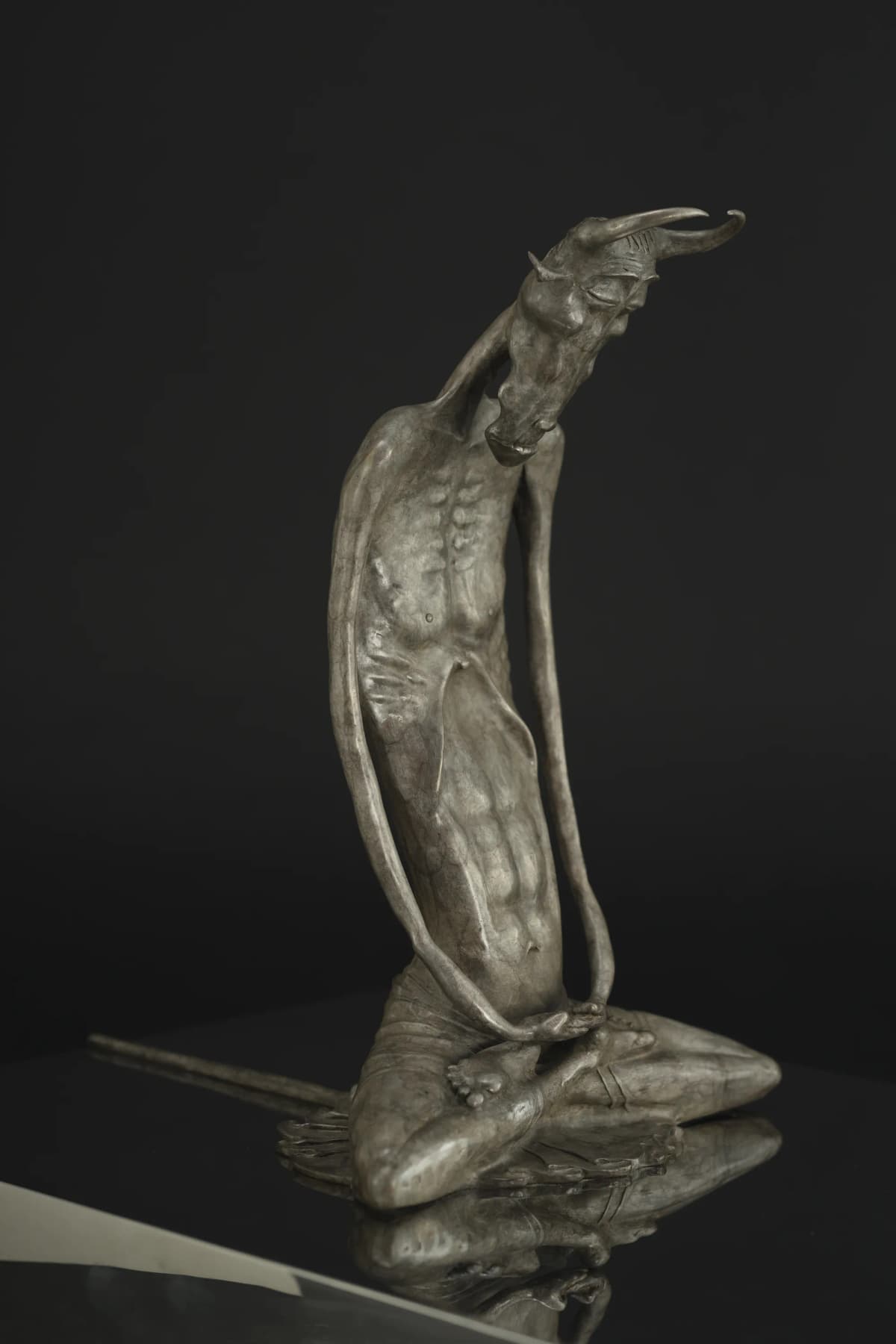
Devil in Meditation
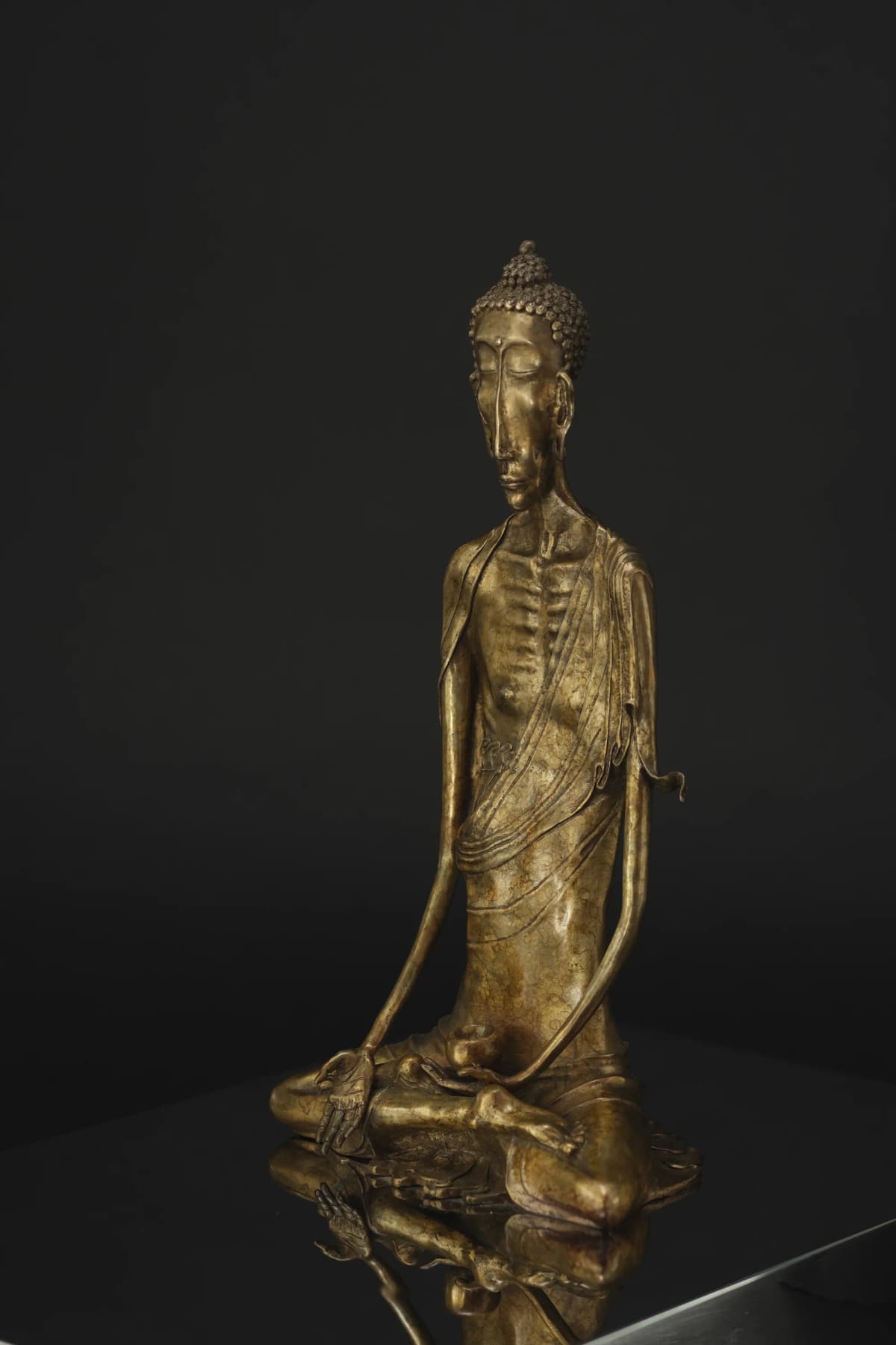
Buddha
"The layout IS the concept."
Two equal panels, no hierarchy, one composition — the structure mirrors the Buddhist duality the sculpture explores. 910studio design rationale.
We shot the exhibition, then designed around it
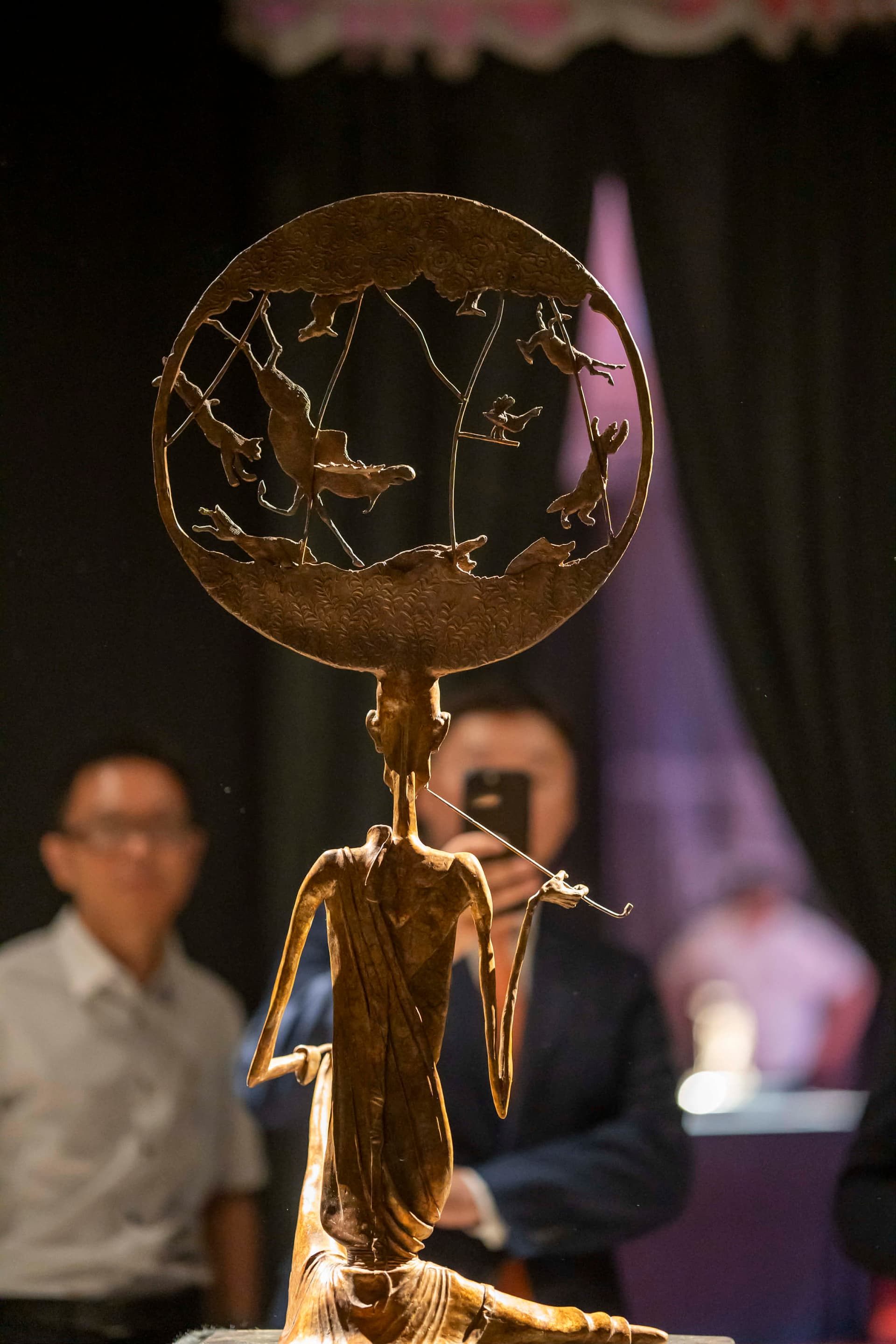
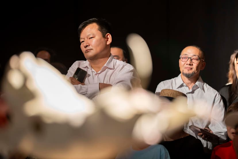
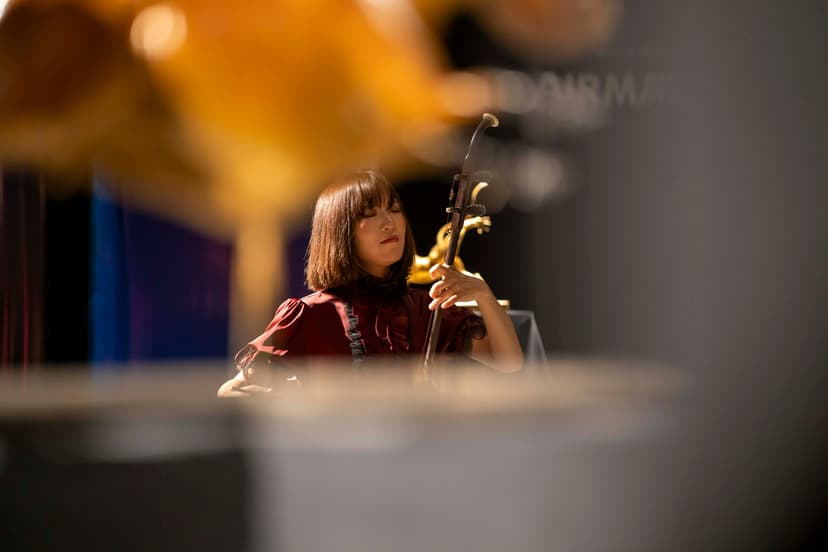
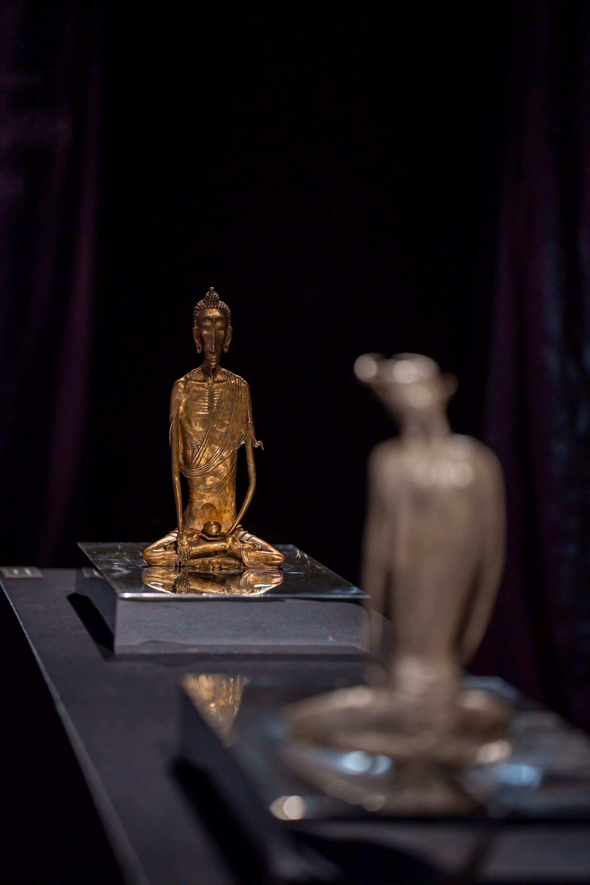
The 2024 solo exhibition gave us real-world content to work with. We built an editorial photo grid on the homepage — 12-column CSS grid with intentional asymmetry. Hero shot at 8 columns, side stack at 4, bottom row splits between portrait pairs and a wide composition. Not a photo dump — it's structured storytelling.
We catalogued 37+ sculptures into a bento grid
Each sculpture needed multi-angle photography, material data, and dimensions — all organized in a way that doesn't bore you at piece #12. We built a bento grid with 6 size variations: hero pieces get 2x3 cells, smaller works fill the rhythm. The pattern repeats without repetition. IntersectionObserver staggers the reveals so the gallery unfolds as you scroll.
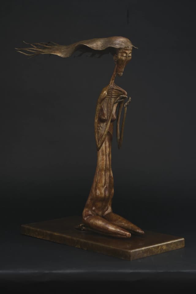
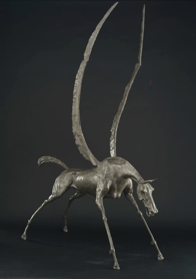
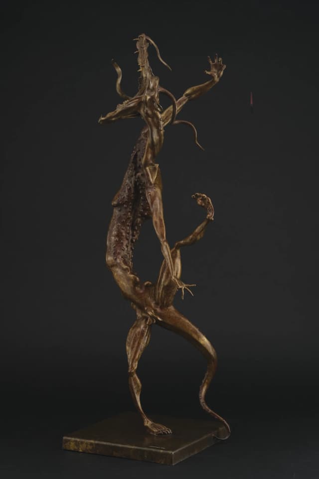
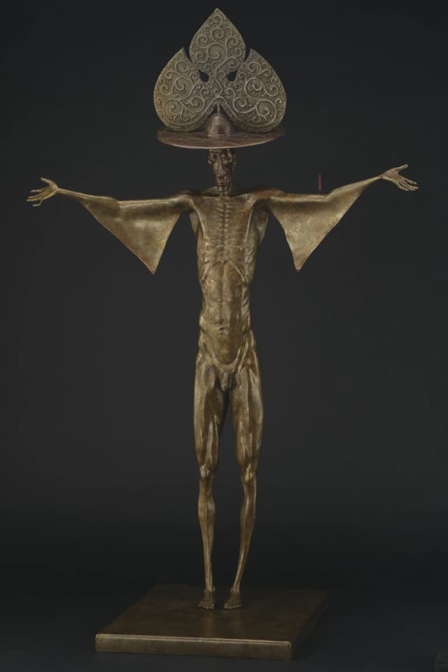
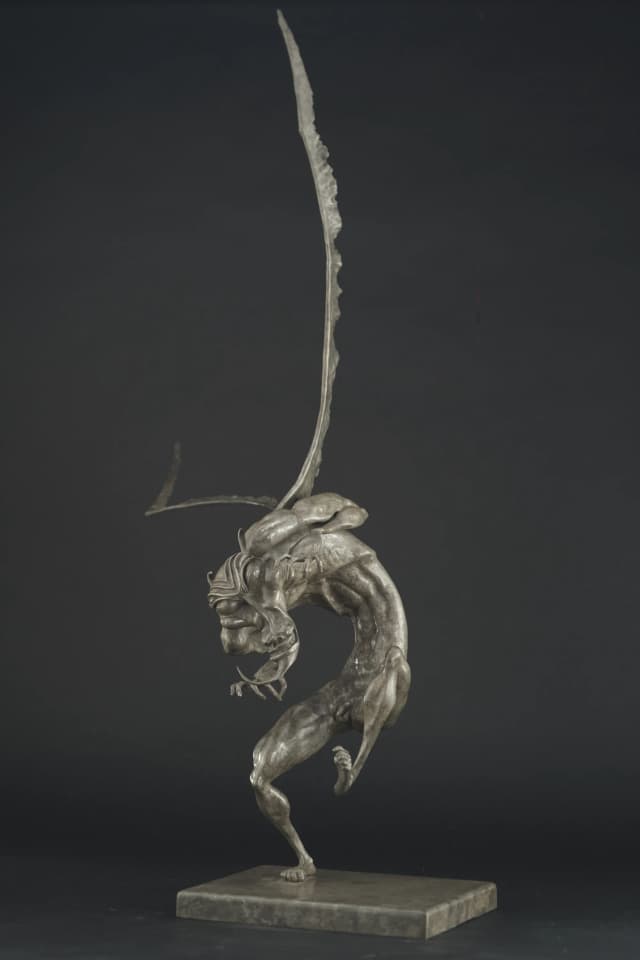
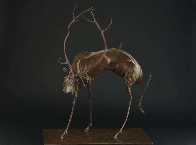
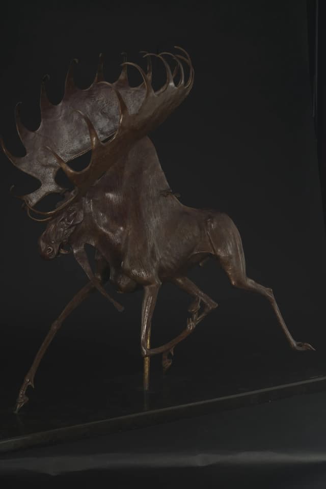
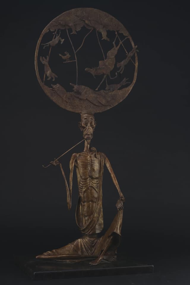
8 of 37+ pieces shown. All bronze, cast and patinated. Full collection at juraan.com/gallery
Five pages shipped, each with a unique layout
We shipped five pages — each sharing the dark gallery system but with unique layout treatment. The constraint: no two pages should feel the same, but all should feel like they belong together. Here's what we built.
Video hero with 7-layer vignette system + film grain, artist intro, God & Devil highlight, bento gallery preview, exhibition editorial grid.
Bento grid with 6 size variations. Stagger-reveal via IntersectionObserver. Background image with 85% overlay.
Cinematic split layout — Devil left, Buddha right, center narrative. Unified vignette. Zoom modals.
Sticky portrait (grayscale → color). Full biography, exhibitions since 1987, awards, Government Palace commission.
Form with subject selector, studio info, Viber integration. Background texture overlay.
Why we chose SvelteKit over Next.js for this one
A sculptor's portfolio doesn't need React's runtime weight. We picked SvelteKit for minimal JS overhead, Lenis for physically smooth scroll, and Tailwind v4 for fast iteration with @theme tokens. Fluid type via clamp() — zero breakpoint overrides. Custom Svelte actions for the stagger-reveal gallery. Deployed on Vercel with adapter-vercel.
| Layer | Choice | Why |
|---|---|---|
| Framework | SvelteKit | Minimal JS overhead. A sculptor's site doesn't need React's weight. |
| Styling | Tailwind CSS v4 | Utility-first with @theme tokens. Fast iteration, zero naming debates. |
| Scroll | Lenis | Smooth scroll that feels physical — matches the tactile nature of bronze. |
| Typography | CSS clamp() | Fluid scaling. Hero: clamp(3rem, 8vw, 6rem). Zero breakpoints. |
| Images | OptimizedImage | Serves desktop/mobile variants via <picture>. Different crops per viewport. |
| Animation | IntersectionObserver | Stagger-reveal on gallery items. No animation library needed. |
| Deploy | Vercel | Edge delivery. adapter-vercel. Preview deploys for client review. |
Shipped. One person. Design to deploy.
910studio took this from zero brand assets to a live cinematic portfolio. Material research, color extraction, custom font design, 7-layer vignette engineering, bento gallery system, cinematic split layout, editorial grid, fluid typography, responsive optimization, Vercel deployment — all executed solo. The client now has a permanent digital gallery at juraan.com.
Sculptures Catalogued
Full bronze collection with multi-angle gallery photography, dimensions, and materials.
Pages Shipped
Homepage, Gallery, God & Devil feature, About, Contact — each with unique layout treatment.
Custom Font
Hand-drawn Juraan display typeface. Not licensed, not Google Fonts — made from scratch.